
Wastewater Collection System Evaluation and Planning
Managing a sanitary sewer collection system inspection is a complex, multifaceted assignment. Many utilities across the country are responsible for the operation and maintenance of sanitary sewers, manholes, and pump stations. Due to aging systems creating an increased potential for Sanitary Sewer Overflows (SSOs), municipalities are now focusing on the management of their collection system in a more comprehensive, strategic manner.
Brett Paige, P.E., discusses establishing the location and condition of specific sewer challenges, the development of hydraulic models for the determination of system capacity, and some technologies available to improve system operation.
Webinar Agenda
- What are Sewer Collection Systems? (0:18)
- Wastewater Collection System Evaluation Overview (2:26)
- What’s Included in the Flow Monitoring Process (10:22)
- Potential Flow Analysis Techniques (13:29)
- Hydraulic Modeling & How It Aids Collection System Evaluations (19:19)
- Condition Evaluations & Available Inspection Technology (24:14)
- Risk Assessment & How They’re Used (32:18)
- Assessment Program Planning Tools (36:34)
- Wastewater Collection System Evaluation & Planning Recap (40:23)
What are Sewer Collection Systems? (0:18)
My name is Brett Paige, and I’m with Snyder & Associates out of our Ankeny, Iowa office. We’re going to go over collection system evaluation and planning.
Jumping into the objectives that we want to cover today:
- Collection system basics
- Understanding the available evaluation methods
- The importance of proper planning
- Budget forecasting strategies
Sewer collection systems are conveyance system networks that are designed, collect, and move flows to a downstream treatment facility. So get the flow from point A to point B through various pressure and gravity sewer networks, sewer structures, pump stations, other facilities, valves, gates, things of that nature. The three types of sewer systems that we commonly deal with are considered separate systems, which would be an isolated storm and sanitary network, a combined system where those two tie together and the most common would be a sanitary accepting a stormwater connection, and that can create capacity issues in your sanitary sewer network. Then a partially separate system where there may be a lack of funding for stormwater infrastructure, or historically that was an accepted method to connect storm to sanitary. And, that’s something that is frowned upon now and that we’re working to correct.
So this is just a graphic from the EPAs website, kind of a useful graphic to present and understand the various type of systems that are available. The pipe network on the left is really showcasing a separate system in which you would have isolated pipes for the sanitary storm. Stormwater drains to a nearby water body for a point source discharge, and the system on the right combines sewer system under normal flows within the capacity of the network water will be sent to the treatment plant. If that flow exceeds the capacity, then there is typically a bypass that would discharge to a river to relieve that system.
Wastewater Collection System Evaluation Overview (2:26)
Evaluation overview, I put together this graphic together, and this is by no means to identify an order or what actually has to be done in that order. Just kind of a brief summary of each and we’re going to go through all of these in a little bit of detail.
Flow evaluation, how we’re evaluating flow data through monitoring and analysis. Capacity evaluation, looking at how we evaluate certain capacities of sewer networks, whether it’s isolated or through a broader scale, with hydraulic modeling tools that we have available. Condition assessment, specifically looking at a risk type assessment to evaluate our network condition, trying to identify priority assets for rehabilitation. And then prioritization, how we’re going to rank and identify which assets do we need to repair now to help reduce risk, then planning and budget forecasting strategies to help with our capital improvement planning and making sure that we have enough funding and dollars allocated to handle some of our routine maintenance.
Flow Monitoring Evaluation A
Jumping into flow evaluation, just want to do a quick summary of what are the three components that we will break out when we’re actually going through a flow assessment: dry weather flow, peak inflow, also referred to as rainfall-induced inflow, and infiltration (RDII) and then slow infiltration. We’re going to go into each of those in a little more detail in a few slides.
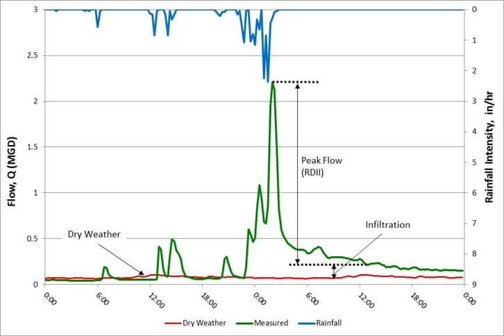
A hydrograph is a way of displaying water level information over time.
This graphic of a hydrograph from a flow monitoring output. We’re typically using the graphical output to understand the data that is collected, and we will plot rainfall intensity at the top, which is shown in blue. We like to do intensity inches per hour versus, if you have a rainfall that occurs over an entire day, maybe you get three inches, but did two of that occur within an hour.
Peak Response
The peak response is going to be a lot more important to understand in that fashion for us to see how quickly the system responds and how we can quantify the flow and infiltration. We will plot the dry weather flow at the bottom to understand what’s the base flow that we’re building off of to see what our peaks are. And that’s a seven-day average, typically. From a low flow period, the green is actually the system response collected from the flow monitoring equipment, and you can see that large peaking factor that we get after the rainfall event occurs. It’s quite substantial from a peaking factor perspective. I threw on just a system capacity horizon on a line. This is something that we would also plot on there. I can’t necessarily say that that is exactly applicable to what this system can handle. Still, it does show the representation that we can see that our system’s clearly undersized, and we may potentially run into some issues.
Dry Weather Flow
So dry weather flow is anything that refers to the normal wastewater production that we as human beings produce, whether that’s going to the bathroom, showering, dishes, laundry, everything, and above in that nature that we’re producing, that’s actually being sent down a sewer. Residential and non-residential use both from private homeowner perspective, commercial businesses, industries, everything that’s being sent down the sewer with as little or no stormwater and that flow as possible. We will quantify that during the lowest flow dry month in a year to try to establish that low point where we have as little clear water as possible to build off of, to establish peaking factors.
Peak Inflow
Peak inflow is the increased portion of water in a sanitary sewer system that occurs after our rainfall. The graphic that we talked about a few slides ago with the hydrograph is really causing the most stress on our system. It’s the rapid response that we get from those quick inflow sources. This is attributed to, the main cause of sanitary sewer overflows and basement backups with that excess clear water that’s being sent into the system that cannot handle that much water.
Inflow Sources
Inflow sources, just to understand where this water is coming from storm intake connections. If you had a combined system, I think that’s a pretty obvious one that would cause issues from surface runoff entering the sanitary system. Sump pumps are a big one that I like to break out and talk about in a little more detail. There are older communities that maybe the topography’s flat. They have inadequate stormwater infrastructure that maybe there is no discharge point, and decades ago, it used to be acceptable to connect your sump pump to the sanitary line. If you get multiple houses on, say, an eight-inch pipe, these sump pumps can be putting out 20, 30, 40 gallons a minute, and during a high groundwater period, that really can add in a tremendous amount of flow into the sanitary system that is not designed to handle that. So that’s one of the sources that we target if we’re looking at some separation opportunities, the biggest bang for our buck. Roof drains, kind of the same thing. You know you get a lot of service water runoff into the sewer system, any voids missing castings, things that are going to allow rainfall to enter our sewer system quickly.
These pictures are from a combined system here in Des Moines, Iowa. We’ve been working in this area for quite some time over the past four or five years, helping the city out with some separation work, and this is just kind of a representation of what we deal with. Even this is just showcasing a combined system. The stormwater is one undersized, and two, we’re getting more than we can handle from the surface down in there, creating flooding problems and other issues. But really, this just kind of gives us a visual of some of the issues that can be experienced both at the surface and just sort of imagining this water building up in the street and getting pushed down into the sanitary system, downstream creating issues throughout the network as a whole.
Infiltration
Moving on to infiltration, clearwater enters a sewer below the ground. So really, what we’re paying attention to is groundwater fluctuations. As you can imagine, after rainfall occurs, we’re going to get some elevated levels in our groundwater system. If we have a period of wet weather where our rivers are elevated and high, groundwater will come up with that too. So paying attention to what level the groundwater is compared to our sewer network. And depending on the condition, if we have defects in the sewer pipe, we’re going to get some groundwater treatment into our network and get conveyed downstream.
Infiltration causes an increase in sewer flow and overall treatment levels.
Infiltration sources, age, I think that’s probably a pretty common understanding. It’s not always the case. There are a lot of other variables in their material type age. It’s a good starting point if you’re looking at your system and trying to understand where some opportunities might be with some defective sewer assets. Offset joints, poor installation is a big one. This is common if they were installed decades ago or even today. Installation is everything being able to have the proper compaction, the right bedding material, and everything’s placed in the backfilled trench in the proper way is everything for the longevity of our sewer assets. Historically clay pipe was more accepted than it is now; we see a lot of plastics. If you get a poor installation with a clay pipe, you’re going to see a lot of cracking and a lot more susceptibility to seeing those defects that are going to allow clear water to enter the pipe below the surface and cause that damage. And then that routes the last point on here. I think this is somewhat hard to avoid, but there are certain maintenance practices and things that we can put in place to help with that. But, as roots enter the system from above ground tree growth or separating part of the pipe joints or entering through a crack, creating more of an opportunity for clearwater to enter the system there and create blockage issues as well.
So what are the impacts of excessive I/I? Increased flows to our treatment plant. I think that it’s one of those things, the more volume of water a treatment authority has to actually pay to treat, it’s more expensive, and everything that we’re sending down there beyond what the wastewater production is that comes with a dollar amount, so, there’s an impact to that.
Overflows
Overflows, whether that’s into the street, through surcharging of a manhole, or an illicit discharge to a downstream water body. Basement backups, nobody likes a wet basement. These are common, which is really a result of too much clear water getting into our sanitary system. Reduce capacity, again, sending more clear water into the sanitary network than it’s designed to handle over time, critical downstream facility failures. This would include any pump stations. Say that you get into the comparison of upsizing an existing pump station to handle the increasing amount of clear water. The I/I getting into our system requires a higher capacity. We can start looking at areas we can rehab and hopefully reduce some of those priority areas to avoid upsizing that pump station. Expensive O and M chemicals to treat the wastewater power to operate our pumps is really what that relates to.
What’s Included in the Flow Monitoring Process? (10:22)
What’s included in the flow monitoring process are the flow media equipment and rainfall gauges. A big point that I want to stress is if you’re going through a flow monitoring project, don’t just rely on local and national reported data such as airports. It makes it difficult for us to process that information and understand. What we’re trying to do is look at a system response, and if we’re getting rainfall-reported data that is 10, 15 miles away, anything that’s not local makes it very difficult. I think in Iowa specifically, we see a lot of thunderstorms that are very isolated. I’ll give an example here in Des Moines. We can get a thunderstorm that maybe hits the Ankeny or Urbandale area and gets two inches of rain. I live down on the south side, and maybe it doesn’t rain at all. That just kind of visualizes why it’s important to have a local rainfall gauge. Typically we want a rainfall gauge for the flow monitoring project that’s within five to 10 square miles per gauge.
Delineating subsystems to target smaller sewer sheds, just trying to pick out where our meter should be to isolate pieces of the system off as we look to prioritize areas that might have higher I/I than others and where we want to start with our inspections. These are just some general recommendations here for some approaches that we typically look at at the high level when we’re looking at planning, a flow monitoring project. One meter to every 40,000 feet of sewer, there are a lot of variables that go behind the scenes that depends on urban density. There are a lot of commercial, industrial, residential properties. There are certain values that we try to target, but really what we’re trying to do is establish enough flow that goes across our flow meter that is laminar, non-turbulent, that’s not restrictive from the surcharge, and that’s given us enough velocity. So we get a decent amount of accurate data as we collect the flow monitoring component.
And then the monitoring period. I think just understanding the goal here. If we’re trying to establish how much clear water is in our system, we want as wet weather activity is possible. Typically we’ll do a three-month monitoring period, whether in the spring or the fall, depending on where you’re located, but really trying to capture some thunderstorm data to project out some of that peak inflow and those infiltration values. This graphic here is representative of some subsystems that we broke out for this project, and these are represented to be completely isolated from the others. There’s no crossflow unless there’s a bypass line, which we would include a flow meter there as well. But, essentially, everything is draining out to the main trunk sewer. In that way, we can prioritize these subsystems to maybe tailor our approach to where we want to evaluate first or look at which areas might have the most I/I in there on a per-acre basis.
This is an example of what we see from a flow monitoring equipment output. We’re processing all this to actually quantify a flow, but this is what’s being reported from the meter. We’re getting a depth in velocity and just want to explain how the data is considered valid versus invalid or needs to be cleaned up. The graph at the top is representative of a restricted flow. So you’re getting a lot of inconsistencies with a velocity and depth, and so there’s a surcharge in there, and the velocity is just going all over the place.
You can see there’s really no trend line on the bottom. You get a free flow. This is good data. You can see that pretty consistent trend line as velocity increases, our depth increases within that metered sewer shed.
Potential Flow Analysis Techniques (13:29)
Flow analysis, I’ve got a couple of flow analysis techniques that I’m familiar with and just want to go through those at a really high-level overview of what’s out there and what we typically look at. The main goal we’re trying to quantify sewer flows, dry weather, inflow, and infiltration. We’re using that rainfall, depth, and velocity to create ratios and project out values for different theoretical storm occurrences.
Inflow Coefficient Method
There are software programs available on the EPAs website, and we have some internal spreadsheet tools that we use. We’re using graphical displacement information to understand thousands and thousands of rows of data and just creating that graphical output that we can understand from the engineering level, what the flow data means, and then existing in future projections. Inflow coefficient Q versus I, we’re referencing the rational formula for runoff, and we’re replacing that runoff coefficient with the KP value. That KP value is representative of the average coefficient solved, based on the storm characteristics. So you’re getting a ratio of the flow, the intensity in the area, and we’re selecting storms that have a certain KP value. Other criteria that we’re using to actually select storms is going to be based on the amount of depth of rainfall that we received over the sewer shed. Typically, we’ll look for anything greater than a quarter-inch just because we want to see that system response, and you can kind of get some diluted data if you include anything less than that. It does affect your trend projection as we plot Q versus I.
This is the final output of the inflow coefficient method, jumping from the overview to the actual final product that we’re using to evaluate the system. We’re using this to project flows out. With the triangular points there, you can see that we have some that are filled, some are not. We are selecting storms based on the criteria to establish that trend line of our peak flow. And you can see that there’s a linear relationship going out to the right as the intensity picks up and our flow does as well. Then we’re building our infiltration value and our average daily dry weather onto that, and then we’re projecting that out to see what our system can actually handle. You can see both have the same slope. So we’re using that trendline projection to identify what theoretical storm event can my system handle before it is surcharged, or we’re going to start having capacity issues. What this graphic is telling us here, the system that we’ve completed this analysis for can handle just under a 25-year storm.
For those that aren’t familiar with those theoretical storm events, typically, we’re looking at projecting out up to a hundred-year storm event, which would be rainfall that here locally in Des Moines would be over seven inches of rain in a 24 hour period. There’s a 1% chance of that occurring in any given year, so we’re trying to optimize what do we need to size our system to. Obviously, I think sizing to a hundred year is economically difficult. So we’re typically targeting a lower frequency storm to do that and this is just allowing us to understand the capacity of our system with these projections.
RTK
So RTK is another method that we will use to evaluate peak flow in our sewer systems. This is an accepted EPA-approved method. They have a toolbox that you can access online that has predeveloped spreadsheets where you can input data to help with some of the analysis. Really this process is fitting up to three triangular hydrographs compared to what an observed overall fourth hydrograph would be. So the red triangle shown here is actually what was reported, and then we’re building the other three hydrographs from the rapid in-flow, the modern infiltration, and slow infiltration. The first hydrograph is built around the rapid to the peak. The moderate is going to be the back half of that actual reported flow curve after the peak has occurred and then the slow is going to be the value that’s still above the dry weather that we have in an elevated condition of clearwater entering our system.
What do these acronyms mean? The R-value is going to be the fracture of rainfall over the sewershed that enters the collection system. T is the time to peak, and K is going to be the ratio of time to the recession, to time to peak.
How this system works, it’s essentially a spreadsheet tool that we can go in and manipulate these values within reason. There’s typically a starting point that we like to see these values within the range of. For example, T1 for the first triangle within half hour to two hours, T2 is going to be two to four, T3 would be three to six. So we’re going in and manipulating these fractions and ratios to try to get something that matches up to the overall observed hydrograph. This is a widely accepted process. It’s great to help with our modeling inputs and just about with anything, you know, the more experience you have gone through this process, the quicker it can be.
So what are we trying to do with this data? We’re trying to quantify base flows for our dry weather periods, establish our peaking factors, how much I/I is in our system, project out theoretical rainfall events to understand capacity limitations. Future planning, if we want to expand to handle a larger frequency event, maybe understand some of the I/I reduction that we get from pre and post-flow monitoring from rehabilitation. Determine our criteria for model inputs and evaluate limited capacity locations.
Capacity Evaluation
Jumping into capacity evaluation, and some of the basics. What are we trying to design for? Average daily flow to handle the low flow periods daily flow plus infiltration. So kind of a normal spring month, maybe that groundwater’s elevated, and we’re handling that small fraction of excess clearwater with our wastewater production. Then peak flows look at RDII plus all the above. So how does our system respond under all those scenarios?
Mannings Equation
Manning’s equation. Not going to go into a whole lot of depth with this, but really this is if we’re looking at a singular pipe network, this is what we’re designing off of before we get the pressure flow, and these are the variables that we see. This is good for a small handful of pipes, and a point to make varying slopes are going to result in varying capacity. We steepen up a pipe it’s going to result in more flow capacity of that piping system. And one of the things that make this difficult to employ on a larger scale, if we’re doing a system-wide capacity evaluation, the iterations that it would take to do all that by hand are just almost unimaginable from an effort standpoint.
Hydraulic Modeling & How It Aids Collection System Evaluations (19:19)
Jumping into why we use hydraulic models and what they are. Hydraulic modeling is a computer-aided simulation based on user input criteria. We’re pushing flow into the system and seeing how it will respond. And again, one of the benefits of having a hydraulic model, we can simulate flow patterns at a click of a button, and it really allows us to evaluate a large amount of data in a small amount of time. One key approach when we’re doing hydraulic models is to always question everything. There’s always something that can probably be corrected or manipulated in the model to make it better. I think models are foundationally built on making assumptions, and being able to reduce as many assumptions as you can is only going to improve the accuracy and output of the results that you’re getting.
Why do we need hydraulic models? Collection systems are complex. If you’re in a larger community, you have gates, you have bypasses, you have a large sewer shed area with a large amount of flow and miles and miles of sewer pipe. If we had to do that all by hand, it would be almost unachievable. We’re able to build a network and simulate hydraulic calculations on a massive scale at the click of a button and have a computer-aided process with that for our basis. They allow us to understand the system, we can quickly identify problems, and if we’re getting into some of our design alternatives, we can make some small changes and just see what happens not only to the improvement that we’re actually evaluating but maybe there are some downstream impacts as well that we need to evaluate.
Typical Modeling Objectives
Typical modeling objectives, we’re trying to evaluate capacity, looking at location frequency and volumes of overflows to understand where some of the worst areas might be, identify system improvements, bouncing back and forth between alternative feasibility, trying to optimize anything that we have recommended for improvement through other assessment methods and prioritize basement backups to hopefully understand where the restriction is relating to those common locations as well, and then reduce flooding. All the above.
Model Development and Calibration
I think GIS networks within communities are more common now, and having a base GIS network is really a good starting point and gets us a little bit ahead in the process, depending on the quality of that information. But, most models are being built from GIS data as it’s available, and then we’re truthing that with any As-built or plan data, sending our survey crews out for any data gaps that we need to fill, whether that inverts information or RIMS, things of that nature. Facility information, looking at pump curves, operation settings. If we have any SCADA data where our gates are opened to closed at certain flows, any weirs, things of that nature. Sewer shed hydrology, time of concentration, how quick is that flow getting downstream to the point in the model. That’s really established from some of the flow analysis processes that we previously discussed and then estimating flow values from the output.
Once we have a model built, we’re going to need to calibrate it to make sure the results that we get are representative of the system that we have modeled. We’re going to take flow meter data and try to do that and replicate real flows in the model to try to achieve the same peaks and base dry weather flow for the rainfall events that we’ve seen. As we’re going through the calibration process, we’re getting different flows, we’re tweaking things that are going to make the model system output flow more similar to what was actually recorded.
Some of the things that we’re going to adjust are going to be the Mannings Coefficients, which will be the smoothness of pipes that we have throughout the network, flow factors, any peaking factors that we may be employing connectivity, sometimes we figure out through the modeling process that certain pipes don’t actually connect to each other and they’re sending flow in a different direction so correcting that and then various time to peaks, or time of concentrations that we’re seeing. A lot of this is based on engineering judgment. I think just over time, with experience doing these types of projects, you just get a feel for what’s actually acceptable, what’s within range, and using some of those tools to understand what’s actually happening upstream and what should be expected and making those corrections as you go.
Capacity Evaluation
So taking the model, doing a capacity evaluation, whether that’s just for a singular pipe or a small part of the system, or doing a system-wide capacity evaluation, we’re looking at hydraulic grade lines to identify certain restriction points, and then as we look at prioritization, working downstream to upstream. If we start upsizing upstream before downstream, we’re going to be sending more flow already restricted systems. So just make that point to prioritize as you work your way up.
This graphic here is just a 1D (dimension) output of a hydraulic model for a couple of pipes, and just want to highlight what we see from the modeling perspective. If we look at the right side of the graphic, the purple line is our hydraulic grade line, so that’s representing our head losses in the system, and so it’s running parallel with our flow at this location. As we work our way to the left, you can see it starts to break away, and in the second pipe segment from the left, we start to see an increased slope. So we’re looking at slopes and a hydraulic grade line, and those are kind of the priorities for capacity restriction. As we see more slope, we’re getting more head loss on a per-foot basis is what that’s representing.
Condition Evaluations & Available Inspection Technology (24:14)
A lot of communities have a regular sewer network inspection program in place, which is great. What are we trying to do? We’re trying to inspect our sewer mains, our manholes, and pump station gate facilities to establish any structural maintenance and I/I defects that we have. We do that through various system codes that identify defects, reporting methods, and photo documentation.
I’m going to go over a couple of the technologies available for sewer network condition inspection: acoustic pipe, smoke testing, dye testing televising, and then some multi-sensor inspection that we’ve utilized here recently in Des Moines that is somewhat new to the industry.
Acoustic Blockage Inspections
Acoustic blockage inspection is typically a preliminary type assessment. It’s not giving us a full condition. It’s identifying leaks and blockage locations. It’s using the sound of water to pinpoint defects that are related to I/I, water entering the system, roots, grease, and debris. Really the non-leak structural defects won’t be processed, which is kind of a downfall. But again, this is a preliminary type of inspection that could be used to identify cleaning needs or where you could start with a more in-depth type of assessment.
I guess generally limited to the smaller diameter is kind of the benefit of this type of inspection. Six to Twelve inches is recommended when using the first inspection. In larger diameters, there’s just more surface area for the sound to travel around. So the graphic here kind of just showcases that difference. If you had the same size of blockage, you just get a lot more surface area that the sounds allowed to pass, and maybe the percent block that comes back doesn’t represent as much of a priority as you might think. And so there’s a scoring system that’s internal to the acoustic type inspection, and that’s the rating that comes back based on some calculations of the software.
One benefit, if you really want to do this as a preliminary type inspection, it is a lot cheaper than televising, and you don’t have to pay for any cleaning. It is an applicable method, I would just stress some caution when you’re basing improvements off of just the acoustic testing. I would feel that this is more of a preliminary effort to understand where a more detailed analysis in your system should take place.
Smoke Testing
We’re going to be doing smoke testing on public and private systems to identify defects, looking at trying to find those I/I sources, such as roof drains or surface voids. We pump smoke into the sewer, and there will be a field crew that will walk pipe or the adjacent area and tries to identify if they see any smoke above ground and mark those with flags. Then we’ll take survey equipment out and get a GPS location on those to try to understand from a mapping standpoint what those locations might be attributed to. Public outreach is key for these types of inspections. Making sure that you coordinate with the local fire department before the inspections take place is critical to make sure that we don’t get any unnecessary response calls to the fire department. Just some preliminary price data on here, 35 cents to three-quarters of a dollar per foot basis. That’s a pretty wide range, but again, the cost can depend on the scale, the quantity of the footage that you’re inspecting, and the location.
Dye Testing
Dye testing is pretty much the same approach. We’re putting material into the sewer that we can trace sources, whether that’s a surface void or a certain service connection. So, the connections that we would typically identify are going to be conduit-based, any sump pumps, sewer services, going into the sewer main, and then surface void verification. We can do that. Commonly, you’re going to put this dye in someone’s bathroom fixtures and send it down the drain. I have seen it done where we have pumped dye into someone’s yard to identify if we do get any groundwater entry into the sewer system. That becomes more difficult to manage from a cost standpoint, we don’t really know how much it’s going to take and so that can really run a risk of just running up the actual cost commitment for that type of inspection if the method is needed. So just a little bit of caution, if you’re thinking about using dye testing to identify a surface defect, I would probably lean towards a smoke test first.
Some of the reference data from recent proposals, $200-$300 an hour for dye testing to get someone out there or someone’s house and just try to identify that source.
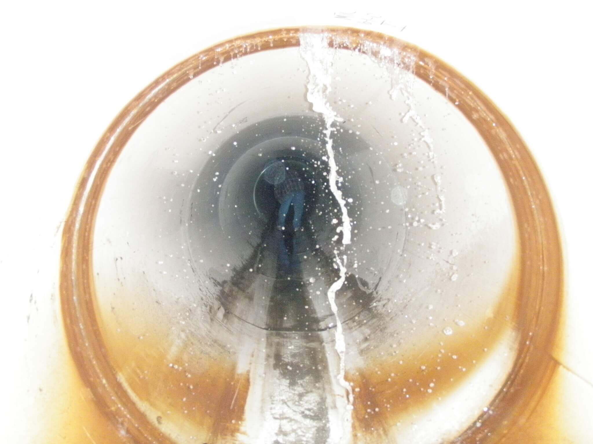
CCTV
CCTV is most common, trying to get a visual understanding of the below-grade asset. NASCO PACP coding, a nationally recognized pipe assessment program produces videos and reports. Prices vary by location, size, scale of the project. $2-$3 a foot as a starting point again. Depending on diameter, how many feet you have to inspect can vary either way, but we’re essentially just trying to get defects identified through the sewer pipes through a coding process.
So the multi-sensor inspections, we used this type of technology on some large diameter pipes here in the Des Moines metro. This is really where it’s the most applicable for the larger diameter sizes. For that project, this data is five or six years old, but we saw $6 per linear foot, and obviously, that is probably higher now, but some of the information that we collected with this technology is a high-definition video. It really is running down the pipe, and we’re able to stitch together photos that we can stop, pan, tilt, and zoom on certain defects and in high-quality output so we can see things better back in the office and understand certain parts of the network a little bit better than standard televising equipment.
LIDAR
LIAR, we’re taking a measurement from equipment that actually sends out signals to measure back how long that takes to bounce off the wall and come back above the waterline. That LIDAR equipment has taken a measurement from the no nominal diameter of the pipe and subtracted that out to get actual inches of wall loss that are gone in that large diameter asset. This laser is getting a visual of the ovality, just projecting out a red line to understand if we’re getting any squishing or inconsistent pipe shape as we run down through the inspected asset.
Sonar
And then sonar, trying to get a debris tabulation below the water line to know how much sediment has to be removed from the sewer. This graphic showcases the MSI output, and there really is a ton of information in here just in one picture. This is great from a review standpoint, being able to understand some of the output that comes with this as we try to prioritize assets for rehab and understand the inspected system. So the top left, that’s showcasing the actual video that we’re seeing, there’s a fisheye lens, that’s why it looks round. But we’re able to stop, zoom in, and see as we go through the inspection, what the pipe wall actually looks like. And then the rollout view in the center gives us a heat map to understand where corrosion is occurring. So, the more red locations are indicating a higher wall loss, so we see more corrosion in the pipe. Then the graphic on the right is just a plan section view of that pipe with the corrosion shown at the top, you can see the yellows and the reds, and then the below surface waterline there gives us a waterline depth of the asset and then it’s difficult to see. There is some green shading there that shows some of the debris levels that are being reported back from the sonar collection.
Technology Recap
So, which of these technologies is best? I think that this is a common answer; it’s unique to your system. Understand what your goals are. Are you looking for structural integrity? Just I/ I? Do you need to assess corrosion in your system? Combination? Other? Just think that these can either be selected independently or we can combine these to create an assessment program that best suits the system. One point to make is if we’re going through the process to actually create a bidding document that we’re going to provide contractors to give us a competitive price, the better quality data that we have can result in improved pricing. I think that the common analogy there is contractors replace unknowns with dollar signs. If we can assess a system and provide more quality information to remove those assumptions, it’s going to result in a better project and a better price.
Prioritization
Prioritization. Last assessment method here, where do we start? Which repairs are needed now? We’re trying to determine priority through ranking tools, and I talked about this a while ago. What are we trying to do here? We’re trying to reduce our exposure to risk, reduce the likelihood of an emergency repair being needed, those catastrophic failures that occur from either a lack of maintenance or just a regular inspection program. I’m going to go into more detail on a risk assessment, which combines what we’re getting from inspection data to a more location-based type assessment. But using that assessment tool to help plan out where we want to start, and where do we get the most bang for our buck spending our capital improvement dollars effectively to help reduce risk?
Risk Assessments & How They’re Used (32:18)
What is risk assessment? It’s a scoring tool that we’re utilizing to identify various weak points in our sewer system. We’re using risk scores that we’re calculating to give us a basis of where to start our rehab and create a guidance program on what the next steps are. The various components of risk are the likelihood of failure, which is really related to the structural condition of the asset from the inspection, and then the consequence of failure. This is more location-based. So we’re getting scores for both of these and combining them together to get a risk frame for the system.
Likelihood of Failure
The likelihood of failure is more or less related to the inspection data that we collected during the condition assessment. Essentially we’re taking what’s reported out from the actual inspection and building in a matrix that allows us to put more weight on certain components.
An example of that matrix is shown below. Depending on the size of your system, you could stop with the overall pipe rating. Here, it was a larger system, so we had some corrosion data that we got from LIDAR and then sediment volume for flow restriction, and we added that into our likelihood of failure scoring for the assets. We’ll rank these on a one to five system, and five represents a worst-case condition. Weights are assigned to each matrix criteria. As you can see in the table to the left, we have certain percentages that would total a hundred. Still, for this particular project, the overall pipe rating is 70% weight, and then the corrosion that was collected through LIDAR on an inch diameter basis is 30% to total a hundred. Essentially each asset that’s inspected from manhole to manhole gets run through this matrix, and then a likelihood of failure rating is then calculated based on those percentages.
So why not just stop here? In some cases, you may be able to, depending on the size of your system or your goals, but sometimes physical condition may not just be enough. Maybe you have financial limitations that you need to make sure that you’re getting the most bang for your buck to identify assets that need rehab.
We’re trying to reduce our exposure to risk and a comparison here, if you had two pipes that were the exact same condition, they’re both very poor. One is out in the middle of a farm field, and one is going to be underneath a railroad; which one would you repair first? The obvious answer is going to be the one underneath the railroad. Because if that failed, it would just be a lot more of a headache than if you had something out in the middle underneath of a field fail. That may seem simple talking about it right now between two pipes, but think about comparing thousands of pipes on a scale like that it’s very difficult to do a prioritization when you’re looking at an inspection project like that. So that is why we will employ a consequence of failure score as well with that likelihood of failure.
Consequence of Failure
So the consequence of failure is the same one to five scoring system, but we’re looking at system-specific criteria, and this is really flexible to what your community looks like or what your goals are. Here we looked at critical crossings, pipe diameter, the depth of assets, land use type. Which would be related to, is it in an urban community? Is it out in the farm field? Did we have the ability to divert flow that was seen as an impact if we didn’t have any diversion ability and the asset failed? That’s obviously a much worse consequence compared to something that would be able to be diverted. We’re really just considering what would be the consequence if that asset failed.
So we’re taking those two categories of scoring and combining them into risk. Likelihood of failure times the consequence of failure to get our risk rating, and we’re going to target the highest risk assets first. I’ll show this curve here in a second, but essentially 20% of your assets are common to be in your highest risk category, and we will target certain inflection points with the curve to break those out. As you can see in this graphic, this is the final output of this inspection project. We’re getting a smooth curve with our risk rankings, and that’s on the vertical scale. The highest risk is going to be at the top of the curve. We’re looking for inflection points where we can break out certain categories that would be at similar assets within that risk range. Really the main goal that we’re trying to achieve with a graphic like this is to create manageable categories to maintain your system. We’re going to work our way from left to right. Generally, you can see that we get worse condition assets on the left side. As you work your way down, the photos provided the assets are in more acceptable condition. So we’re trying to justify rehab with this method but also giving us some guidance on where do we need to start and what does our system looks like?
Assessment Program Planning Tools (26:34)
Some of the planning that goes into this through an assessment program, you’re going to end up with a ton of information to store. Terabytes and terabytes of information, having a system in place to handle that and to be able to quickly reference is going to be important. We’re going to need to leverage ranking tools that we just talked about, and we’re going to take that risk assessment and associate cost to those priority high-risk assets. We’re going to create visual aids to track the status and create schedules to understand impact or graphs and GIS maps. For me personally, I’m a very map-oriented type person, so GIS mapping and being able to understand with an aerial backdrop where some of the projects are located is a great way to understand the next steps and create a visual of what that’s going to look like. Then we can filter out certain risk ranks to try to combine projects. Maybe you have two risk rank five assets and a four in between. It probably makes sense to do them all together in the same project through some of those planning tools.
Building planning level costs, I think there are some more recent difficulties in today’s world than we’ve had in the past. Everybody’s probably aware of the dramatic bidding climate that we’re in right now. It seems like there’s a new shortage for a different material almost every single day. There are other impacts related to that, COVID is obviously a huge factor. Any fluctuations in oil and then hurricanes are another common weather element to pay attention to.
Inflation
Inflation, making sure that we’re planning for that as we’re projecting costs out for decades down the road. Be sure that we’re not undershooting the budget that will be needed years down the road.
Constructability
Focusing on constructability is a big focus that we typically employ from a design level. Still, it’s also good at the planning level to make sure as you’re looking at your recommendations that whatever you’re looking to improve can be built and thinking of all impacts that might be adjacent to that type of improvement whether it’s utility-related or property-related.
Conservative Contingencies
Use conservative contingencies, sometimes 20% – 30%, just making sure that we’re not putting together a planning budget that’s going to fall short whenever that money needs to be allocated thinking about any bypass or temporary facilities that are needed. Bypass can account for 5% – 20% of the project, so make sure that we’re considering all those small detail elements as we’re putting together planning budgets.
Permitting Timelines
Permitting timelines is probably more applicable for getting an accurate schedule. If you have locations where a longer permitting requirement is going to be needed, making sure that those projects are being combined can help lessen some of the permitting difficulties. Then thinking of all scenarios, any system impacts that could result from rehab, such as odor control, more concentrated flows to the plant. Do we want to align one section at a time or smooth that out for multiple sections while we’re there? Just making sure that we’re not so focused on one element of the project that we are looking at a high-level overview of everything that is going to be impacted by that type of improvement.
Available Budget vs. System Needs
Available budget versus system needs. We’re able to take those risk curves and look at a dollar amount associated with all category fives and above and just try to understand how much we can afford now and where we want to stop? Each asset that was inspected is given a point in this risk curve. So we can take each pipe and essentially put a dollar amount to it, and we’re able to break up these categories to identify budget pots, to get to the point where we’re comfortable with the reduction of risk and a point that’s financially manageable for the community.
A quick graphic here on this, just wanting to show some of the things that we look at, wanting to put together a planning tool so we can understand the current financial position of the community and if we need additional capital improvement and dollars. The green is showcasing how much we need per year. If we want to hit our 2027 goal, this is how much money we need per year in our CIP budget to repair everything within the high-risk category. The blue line on here is what we currently have planned, and so there’s a budget gap there just wanting to make sure that these things are understood early on in the project, and you don’t wait till it’s too late, where there are not enough dollars allocated in your capital improvement plan.
Wastewater Collection System Evaluation & Planning Recap (40:23)
So quick recap, there are multiple approaches that you can use to evaluate your system on multiple levels, and there’s really no intended order, but all of them are important. I think that depending on your goals, some can be paired with others or isolated to do a certain assessment. Prioritize, spend dollars effectively, and ultimately reduce your exposure to having those emergency repairs happen in the middle of the night, that going to result in cost savings in the future.
Planning level budgets, starting high, working low, using those conservative contingencies to help with planning to make sure that we don’t fall short with our capital improvement budget. Talk to your engineer. If you have a current asset management approach, or if you have any questions on maybe new implementation or just refining your current approach, just have that conversation and make sure that the plan you have in place is the direction you want to take, focusing on that reduction of risk to your community.
And that’s all I have, had a lot to cover there. Thank you for your time. I appreciate the opportunity to share with you today. If you have any questions, feel free to reach out. I’d be happy to answer them. Thank you.